(from Statistics, by Freedman, Pisani, Purves, Adhikari).
Grown-ups love figures. When you tell them that ou have made a new friend, they never ask you any questions about essential matters. They never say to you, "What does his voice sound like? What games does he love best? Does he collect butterflies? Instead, they demand: "How old is he? How many brothers has he? How much does he weigh? How much money does his father make?" Only from these figures do they think they have learned anything about him.
-The Little Prince
INTRODUCTION
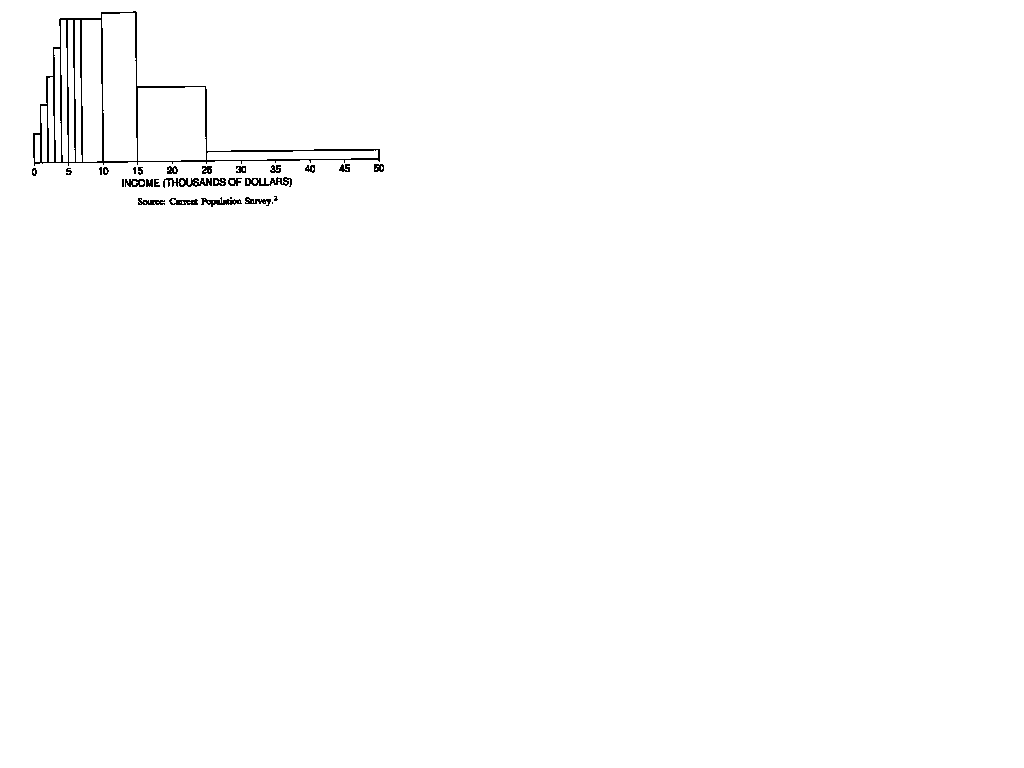
In the United States, how are incomes distributed? How much worse off are minority groups? Some information is provided by government statistics, obtained from the Current Population Survey. The mechanics of this survey will be discussed in part VI; each month, the survey Provides a representative cross section of about 50,000 American families. In March, these families are asked to report their incomes for the previous year. We are going to look at the results for 1973. Of course, these data have to be summarized somehow. Nobody wants to look at 50,000 numbers. To summarize data, statisticians often use a graph called a histogram. The histogram for the income data is shown in figure 1.
Figure 1. A histogram. This graph shows the distribution of families by income in the U.S. in 1973.
NOTE: A histogram represents numbers by area, not height. In this way, histograms are different from bar graphs.
This section explains how to read histograms. First of all, there is no vertical scale: unlike most other graphs, a histogram does not need a vertical scale. The next thing to look at is the horizontal scale. This shows income in thousands of dollars. The graph consists of a set of blocks. The bottom edge of the first block covers the range from $0 to $1,000, the bottom edge of the second goes from $1,000 to $2,000, and so on, until the last block, which covers the range from $25,000 to $50,000. These ranges are called class intervals. The graph is drawn so that the area of each block is proportional to the number of families with incomes in the corresponding class interval.
To see how the blocks work, look more closely at figure 1. About what percentage of the families earned between $10,000 and $15,000? The block over this interval amounts to something like one-fourth of the total area of all the blocks. So about one-fourth, or 25%, of the families had incomes in that range.
Take another example. Were there more families with incomes between $10,000 and $15,000 or with incomes between $15,000 and $25,000? The block over the first interval is taller, but the block over the second interval is wider. The areas of the two blocks are about the same, so the number of families eaming $ 10,000 to $15,000 is about the same as the number eaming $15,000 to $25,000.
For a last example, take the percentage of families with incomes under $7,000. Is this closest to 10%, 25%, or 50%? By eye, the area under the histogram between $0 and $7,000 is about a quarter of the total area, so the percentage is closest to 25%.
The horizontal axis in figure I stops at $50,000. What about the families eaming more than that? The histogram simply ignores them. Of course, in 1973 only 1% of American families had incomes above that level; most families are represented in the figure.
At this point, a good way to learn more about histograms is to do some exercises. To help you judge the sizes of the blocks, figure 2 shows the same histogram as figure 1, but with a vertical scale supplied.
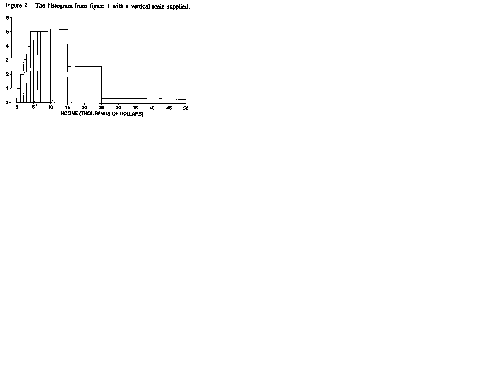
1. About 1% of the families in figure 2 had incomes between $0
and $1,000. Estimate the percentage who had incomes
(a) between $1,000 and $2,000
(b) between $2,000 and $3,000
(c) between $3,000 and $4,000
(d) between $4,000 and $5,000
(e) between $4,000 and $7,000
(f) between $7,000 and $10,000
2. (a) In figure 2, were there more families earning between $6,000 and $7,000, or between $7,000 and $8,000? Or were the numbers about the same?
(b) In figure 2, were there more families earning between $ 10,000 and $1 1,000 or between $15,000 and $16,000? Or were the numbers about the same?
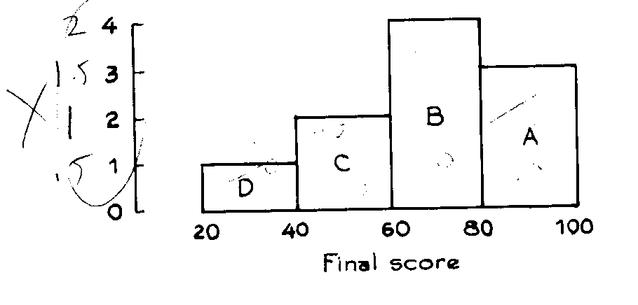
3. The histogram below shows the distribution of final scores in
a certain class.
(a) Did anybody score below 20?
(b) Which block represents the people who scored between 60 and
80?
(c) Ten percent scored between 20 and 40. About what percentage
scored between 40 and 60?
(d) About what_percentage scored over 60?
Exercise Set B
1. The table below gives the distribution of educational level for persons age 25 and over in the U.S. in 1960, 1970, and 1986 . "Educational level" means the number of years of schooling completed. The class intervals include the left endpoint, but not the right; for example, from the second line of the table, in 1960-about 14% of the people had completed 5-8 years of schooling, 8 not included; in 1996, about 5% of the people were in this category. Draw a histogram for the 1986 data. You can interpret " 16 or more" as 16-17 years of schooling; very few people completed more than 17 years of school. Why does your histogram have spikes at 8, 12, and 16 years of schooling?
Educational level
(years of schooling) 1960 1970 1986
0-5 8 6 3
5-8 14 10 5
8-9 18 13 6
9-12 19 19 12
12-13 25 31 38
13-16 9 11 17
16 or more 8 11 19
Note: Percents do not add to 100%, due to rounding.
Statistical Abstract, 1988, Table 202.
| Copyright ©1996 Stephen P. Borgatti | Revised: June 24, 1997 | Home Page |