1. INTRODUCTION
Regression is a technique for describing how one variable varies with the values of another. For, example, take height and weight. We have data for 988 men between the ages of 18 and 24 (from the Health And Nutrition Examination Survey -- aka HANES) The average height of these men was 70 inches, and their overall average weight was 162 pounds. As you would expect, the taller men weighed more, on average. The question we can answer using regression is, how much of an increase in weight goes with an increase in height of one inch? Here are the summary statistics:
average height 70 inches, SD 3 inches
average weight 162 pounds, SD 30 pounds,
r = 0.47
Look at the figure below. The scales on the vertical and horizontal axes have been chosen so that one SD of height and one SD of weight cover the same distance on the page. This makes the SD line (dashed line) rise at 45 degrees across the page. There is a fair amount of scatter around the line; r is only 0.47.
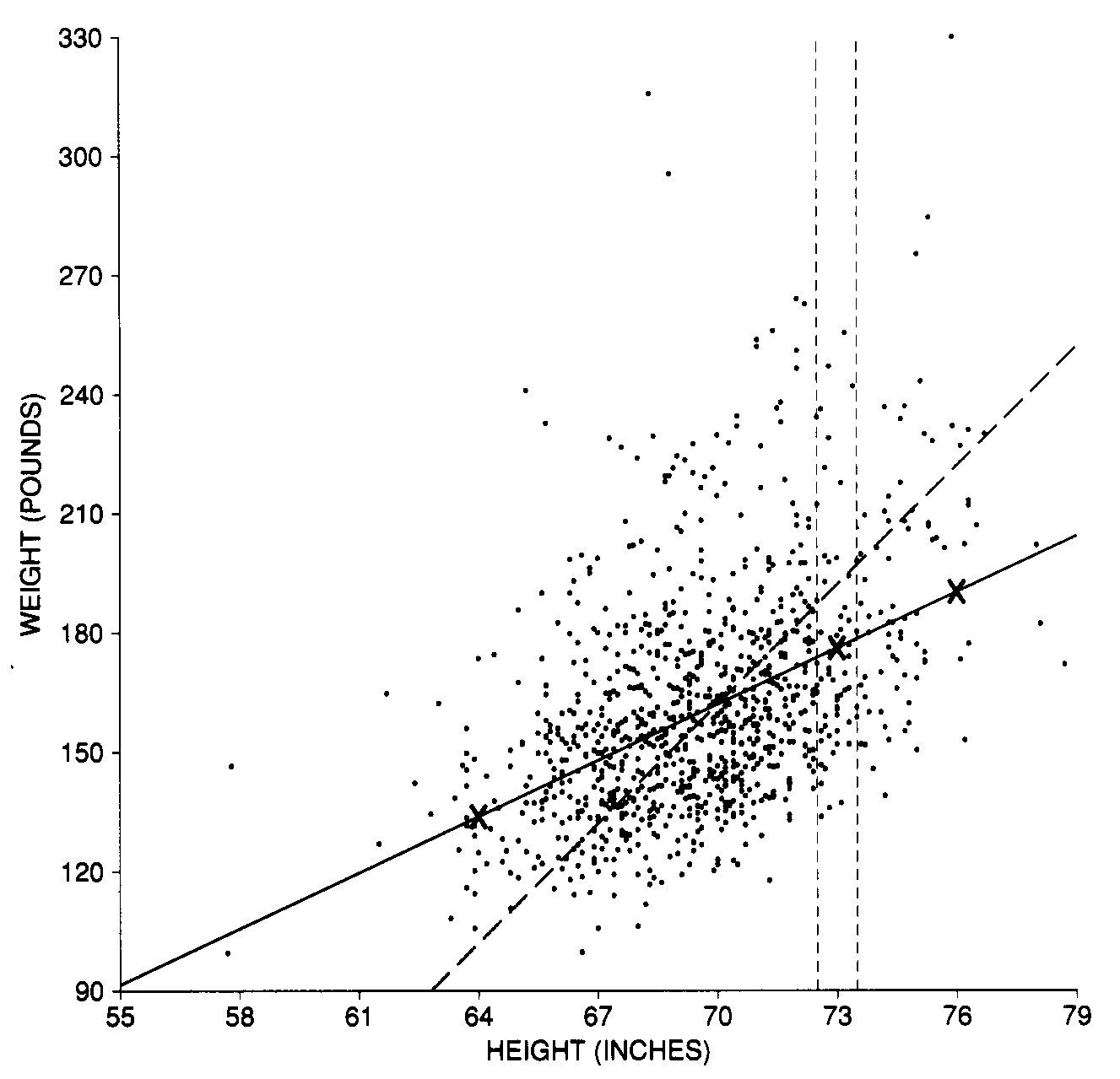
Figure 1. Scatter diagram for heights and weights. Each point represents the height and weight of one of the 988 men age 18-24 in the Health and Nutrition Examination Survey. The points in the vertical strip represent all the men who are about one SD above average in height. Those who are also one SD above average in weight would be plotted along the dashed SD line. Most of these men are below the SD line, so they are only part of an SD above average in weight. The solid regression line estimates the average weight at each height. Figure copied from Pisani et al.
The vertical strip shows men who were within a half an inch of one SD above average in height (the SD is 3", and the average is 70, so we are looking at people around 73" tall, or actually between 72.5" and 73.5") . The men who were also one SD above the average in weight would be plotted along the SD line. Notice, however, that most of the points in the strip are well below the SD line. In other words, most of the men who were one SD above average in height were quite a bit less than one SD above average in weight. So the average weight of these men is only part of an SD above the overall average weight. What part? This is where the correlation of 0.47 comes in. Associated with an increase of one SD in height there is an increase of only 0.47 SDs in weight, on the average.
To be more specific, look at the men who are one SD above average in height:
average height + SD of height = 70 in + 3 in = 73 in.
Their average weight will be above the overall average by 0.47 SDs of weight. Translating back to pounds, that's
0.47 x 30 lb = 14 lb
So their average weight is around
162 lb + 14 lb = 176 lb
That point (73 inches, 176 pounds) is marked by an "X" in Figure 1. The 176 lbs is the predicted weight of men who are 73" tall. It roughly corresponds to the average weight of all men who are 73".
What about the men who are 2 SDs above average in height? Now
average height + 2 SD of height = 70 in + 2 x 3 in = 76 in
The average weight of this second group of men should be above the overall average by 0.47 x 2 = 0.94 SDs of weight. That would be
0.94 x 30 lb = 28 lb
So the average is around
162 lb + 28 lb = 190 lb
The point (76 inches, 190 pounds) is also marked by an X in Figure 1.
What about the men who are 2 SDs below average in height? Their height equals
average height - 2 SD of height = 70 in - 2 x 3 in = 64 in
Their average weight is below the overall average by 0.47 x 2 = 0.94 SDs of weight. That's 0.94 x 30 lb == 28 lb. So the average weight of this third group is around 162 lb - 28 lb = 134 lb. The third "X" in Figure 1 is this point (64 inches, 134 pounds).
All the points (height, estimate for average weight) fall on the solid line shown in figure 1. This is the regression line. It goes through the point of averages: men of average height should also be of average weight.
The regression line is to a scatter diagram what the average is to a list. The regression line for Y on X estimates the average value of Y that corresponds to each value of X.
The estimates of the average weight in Figure 1 increase as you move from short to tall. The increase is 0.47 SDs of weight for each increase of 1SD of height. To be more concrete, imagine grouping the men by height. There is a group which is average in height, another group which is one SD above average in height, and so on. From one group to the next, the average weight also goes up, but only by around 0.47 SDs. Remember where the 0.47 comes from: it is the correlation between height and weight.
The rule is as follows:
With each increase of one SD in X there is an increase of only r SDs in Y, on the average.
Two different SDs are involved here: the SD of X, which measures changes in X; and the SD of Y, which measures changes in Y. It is easy to get carried away by the symmetry of the situation: if X goes up by one SD, so does Y. But that's wrong. On the average, Y only goes up by r SDs, and r is rarely as big as 1.0
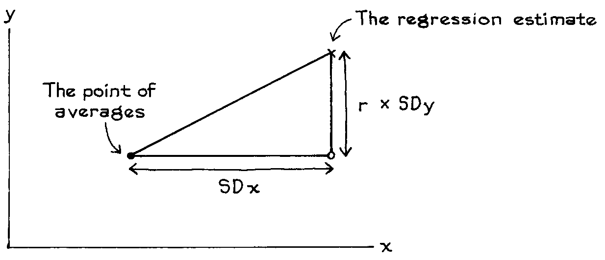
Figure 2. Regression method. When x goes up by one SD, the average value of y only goes up by r SDs.
Why is r the right factor? To demonstrate this mathematically is beyond the scope of this class. But intuitively, look at this. First, suppose r is zero. Then there is no association between x and y. So a one-SD increase in x is accompanied by a zero-SD increase in y, on the average. That makes sense. Second, suppose r is 1. Then all the points lie on the SD line; a one-SD increase in x is accompanied by a one-SD increase in y, and we have perfect association and predictability.
With in-between values of r, the thing to look at is a picture. Figure 3 shows a scatter diagram with r = 0. 50. The x-values and y-values average out to 4, with an SD of 1. The SD line rises at 45 degrees. Along this line, a one-SD increase in x is matched by a one-SD increase in y. Now take the points in the vertical strip over 5, where the x-values are about one SD above average. The average of the v-values in this strip is marked by a cross. This is halfway between the horizontal line through the average of y, and the sloping SD line. In other words, a one-SD increase in x is accompanied by a half-SD increase in y, on the average. Again, r is the right factor.
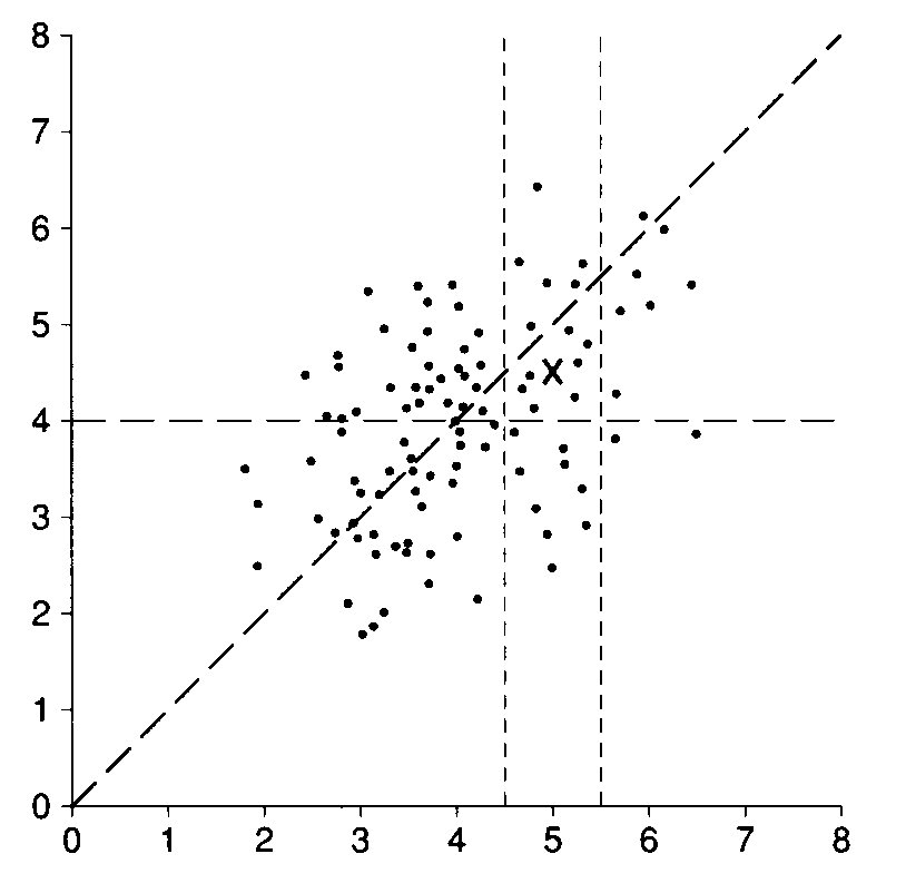
Figure3. A scatter diagram with r=0.50. The average of the x-values and y-values is 4, with an SD of 1. The points in the vertical strip over 5 have x-values which are one SD above average. A cross marks the average of their y-values. This cross is halfway between the horizontal line through the average of the y-values and the sloping SD line. So a one-SD increase in x is accompanied by a half-SD increase in y, on the average.
These notes drawn from Statistics by Freedman, Pisani, Purves and Adhikari.