Sir Francis Galton (England, 1822-1911) studied the degree to which children resemble their parents. Statisticians in Victorian England were fascinated by the idea of quantifying hereditary influences, and gathered huge amounts of data in pursuit of this goal. We are going to look at the results of a study carried out by Galton's disciple Karl Pearson (England, 1857-1936), on the resemblances between family members.
As part of the study, Pearson measured the heights of 1,078 fathers and their sons at maturity. The data look like this:
| Family | Father's Height |
Son's Height |
| 001 | 68 | 69 |
| 002 | 72 | 72 |
| 003 | 69 | 71 |
| etc.. | .. | ... |
A list of 1,078 pairs of heights would be hard to grasp. But the relationship between the two variables-father's height and son's height can be brought out in a scatter diagram (see Figure 1 below).
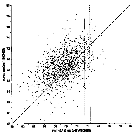
Figure 1. Scatter diagram for the heights of 1,078 fathers and sons. Families where the height of the son equals the height of the father would be plotted along the line y = x. But most of the families are scattered around the line. The scatter shows how a son's height differs from his father's.
Each dot on the diagram represents one father-son pair. The x-coordinate of the dot, measured along the horizontal axis, gives the height of the father. The y-coordinate of the dot, along the vertical axis, gives the height of the son.
Notice that the cloud of points in the scatter diagram slopes upward to the right. This means that, in general, the y-coordinates of the points tend to be low when the x-coordinate is low, and the y-coordinates tend to be high when the x-coordinates are high. In other words, short fathers tend to have relatively short sons, while tall fathers tend to have relatively tall sons: height runs in families. Statistically speaking, we would say that there is a positive correlation between the heights of fathers and sons.
But the scatter diagram also shows that the correlation is not perfect: some tall fathers have super tall sons, others medium height, and a few have short sons. This is what causes the football shape of the cloud. If the correlation were perfect, all the points would line up in a diagonal line, like this:
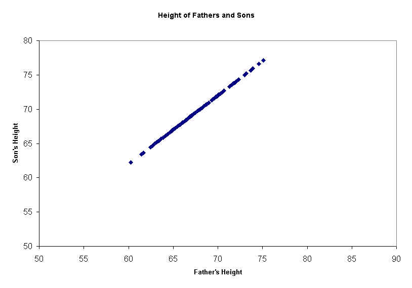
Notice that even in this picture of perfect correlation, the sons' heights are not identical to their fathers' heights: the sons are always two inches taller. But since they are always 2 inches taller, it is completely predictable, and that is what correlation is all about: predictability.
In the real data (Figure 1), son's height is not nearly as predictable from father's height. Suppose you have to guess the height of a son: how much help does the father's height give you? Suppose, for instance, that the father is 72 inches tall. In figure 1, the dots in the "chimney" on the right represent all the father-son pairs where the father is between 71.5 inches and 72.5 inches (where the dashed vertical lines cross the x-axis). There is still a lot of variability in the heights of the sons, as indicated by the vertical scatter in the chimney. Even if you happen to know the father's height, there is still a lot of room for error in trying to guess the height of his son. But on average, the height of the sons for these fathers is quite a bit higher than the heights of the sons whose fathers are, say, 64 inches tall.
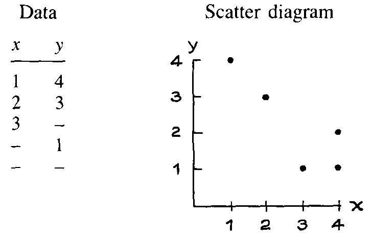
1. Some hypothetical data are shown below along with the scatter diagram. Fill in the blanks.
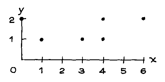
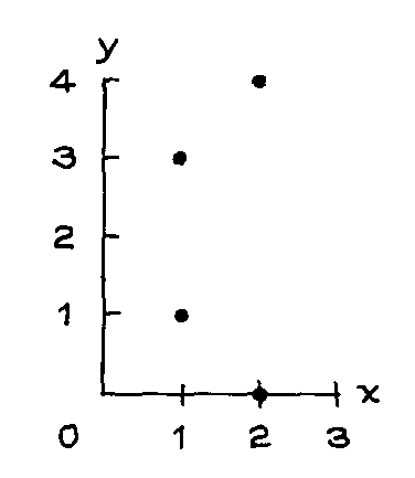
2. Below is a scatter diagram for some hypothetical data.
(a) Is the average of the x-values around 1, 1.5, or 3?
(b) Is the average of the y-values around 1, 1.5, or 3?
(c) Which shows more spread, the x-values or the y-values?
(d) Write down a data table like the one in exercise 1 for this scatter diagram.
(e) Check your answers to (a), (b), and (c) by calculating the average and SD for the
x-values, as well as the average and SD for the y-values.
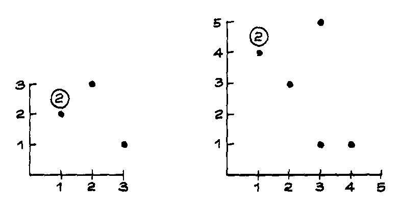
3. In the diagram below-
(a) Is the average of the x-values around 1, 1.5, or 2?
(b) Is the SD of the x-values around 0.1, 0.5, or 1?
(c) Is the average of the y-values around 1, 1.5, or 2?
(d) Is the SD of the y-values around 0.5, 1.5, or 3?
4. Draw the scatter diagram for each of the following hypothetical data sets. The variable labeled "x" should be plotted along the x-axis (horizontal), the one labeled "y" along the y-axis. Mark each axis fully. In some cases, you will have to plot the same point more than once. By convention, the number of times such a multiple point appears is indicated inside a small circle next to it.
| (a) | (b) | ||
| x | y | x | y |
| 1 | 2 | 3 | 5 |
| 3 | 1 | 1 | 4 |
| 2 | 3 | 3 | 1 |
| 1 | 2 | 2 | 3 |
| 1 | 4 | ||
| 4 | 1 | ||
5. Use figure 1 to answer the following questions:
(a) What is the height of the shortest father? of his son?
(b) What is the height of the tallest father? of his son?
(c) Take the families where the father was 72 inches tall, to the nearest inch. How tall
was the tallest son? the shortest son?
(d) How many families are there where the sons are just about 77 inches tall? How tall are
the fathers?
(e) The average height of the fathers was around 64 inches, 68 inches, or 72 inches?
(f) The SD of the heights of the fathers was around 3 inches, 6 inches, or 9 inches?
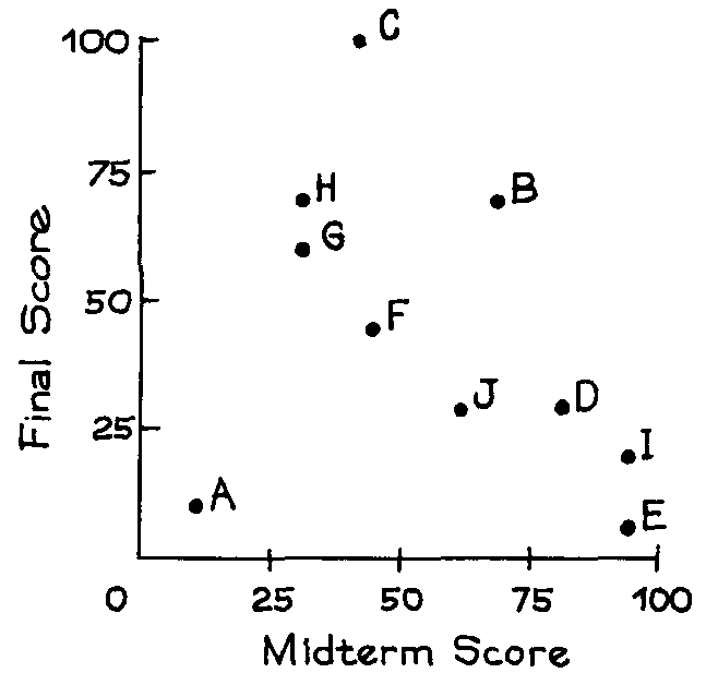
6. Students named A, B, C, D, E, F, G, H, and I took a midterm and a final in a certain course. A scatter diagram for the scores is shown below.
(a) Which students scored the same on the midterm as on the final?
(b) Which students scored higher on the final?
(c) Was the average score on the final around 25, 50, or 75?
(d) Was the SD of the scores on the final around 10, 25, or 50?
(e) For the students who scored over 50 on the midterm, was the average score on the final
around 30, 50, or 70?
(f) True or false: On the whole, students who did well on the midterm also did well on the
final.
(g) True or false: There is strong positive association between midterm scores and final
scores.
7. The scatter diagram below shows scores on the midterm and final in a certain course.
(a) Was the average midterm score around 25, 50, or 75?
(b) Was the SD of the midterm scores around 5, 10, or 20?
(c) Was the SD of the final scores around 5, 10, or 20?
(d) Which exam was harder-the midterm or the final?
(e) In which exam was there more spread in the scores?
(f) True or false: There was a strong positive association between midterm scores and
final scores.
1.
x y
1 4
2 3
3 1
4 1
4 2
2.
(a) av x = 3
(b) av y = 1.5
(c) the x-values
(d)
x y
0 2
1 1
3 1
4 1
4 2
6 2
(e) av x = 3, av y = 1.5, SD x = 2, and SD y = 0.5
3.
(a) ave of x = 1.5
(b) SD of x 0.5
(c) ave of y = 2
(d) SD of y 1.5
4.
5.
(a) Shortest father, 59 inches; his son, 65 inches.
(b) Tallest father, 75 inches; his son, 70 inches.
(c) 76 inches, 64 inches
(d) Three: 68 inches, 70 inches, 73 inches.
(e) ave = 68 inches (f) SD = 3 inches
6.
(a) A, B, F
(b) C, G, H
(c) av = 50
(d) SD = 25
(e) av = 30
(f) false
(g) false: the association is negative.
7. (a) 75. (b) 10. (c) 20. (d) The final: everyone did 50 or better on the midterm. (e) The final. (f) True.
This lecture was largely drawn from Statistics, by Freedman, Pisani, Purves and Adhikari. Most figures are theirs.
| Copyright ©1996-8 Stephen P. Borgatti | Revised: November 15, 1999 | Home Page |